BRIEF
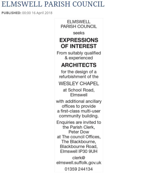
I entered a competition advertised in the local newspaper for the design of a replacement community hall adjoining an exisiting chapel. My design was runner-up out of a number of architects who applied for the job, losing out to a larger firm due to their in-house experiences.
“Despite the enthusiasm and freshness that your approach demonstrated, the caution that surrounds schemes such as this, funded by the community, worked in favour of a larger practice with considerable in-house disciplines available and a track record which makes the ‘selling’ of the choice to the village easier.
The decision was reached by consensus after lengthy deliberation. The extraneous factors which eventually drove the decision had nothing to do with your presentation and I am genuinely sorry not to be working with you.”
- Parish Clerk

INITIAL CONCEPT
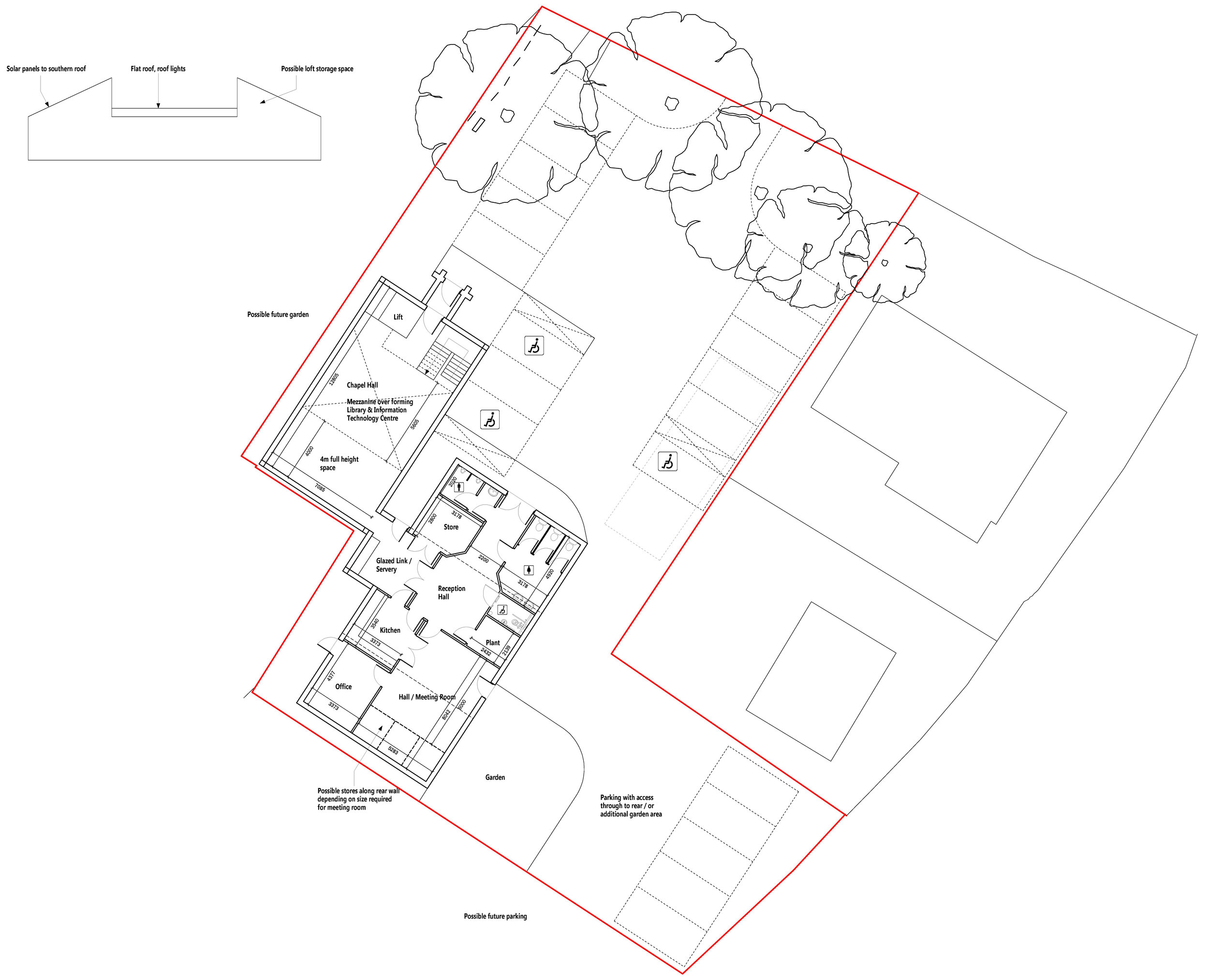
My initial concept ideas were based on the discussions I had with the Parish Clerk regarding what the community required in a building of this nature. This resulted in a scheme consisting of the chapel being used as a main hall, with a secondary hall and ancillary facilities in the proposed extension, with the outside space including an area of additional car parking to the south.

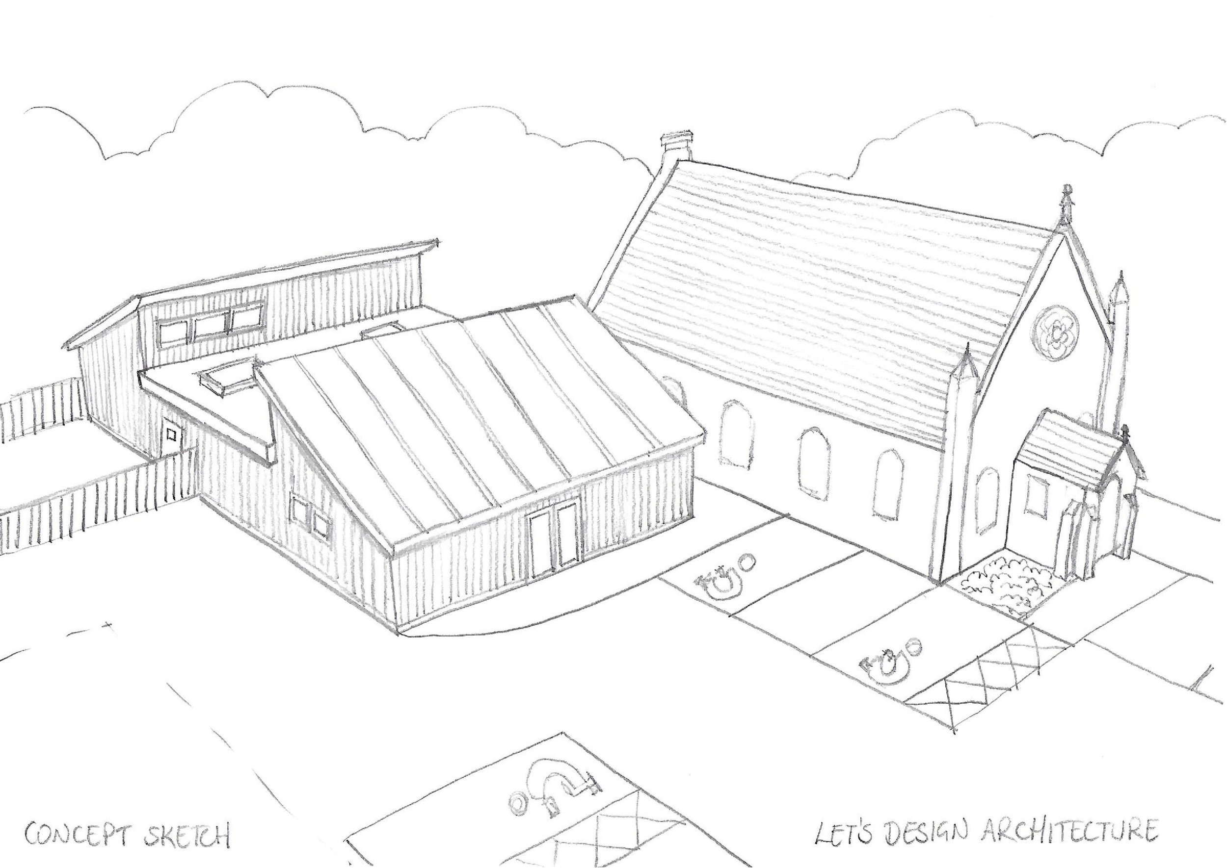
CONCEPT SKETCH
My original concept was to create a hall which was subservient to the chapel, allowing space for the chapel to breathe, not detracting from its architectural beauty. The hall was to be modest in scale and orientated such that it would make best use of renewable energies in the form of solar panels on the south elevation, away from the chapel.

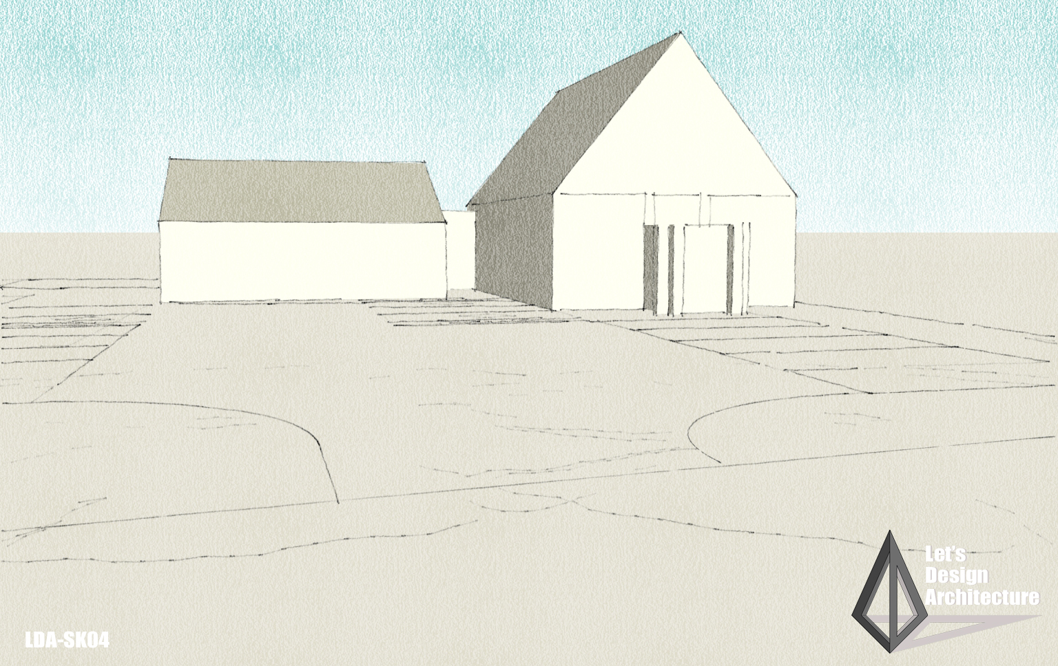
3D BOX MODEL
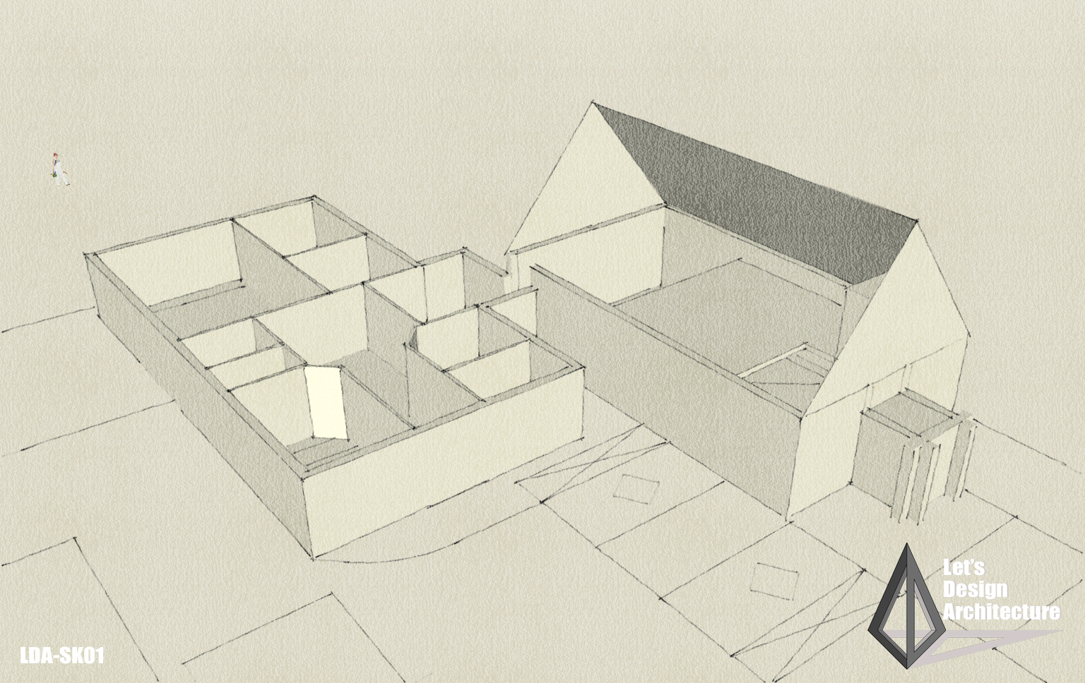
I created a 3D box model to help me build the spaces and develop the scheme. This helped give the impression of the scale of the building and how it would appear from the street frontage.

3D SPACES
I worked up the box model showing the interior and how this might work, again visually helping the committee to understand how the building flows.

SIDE VIEW
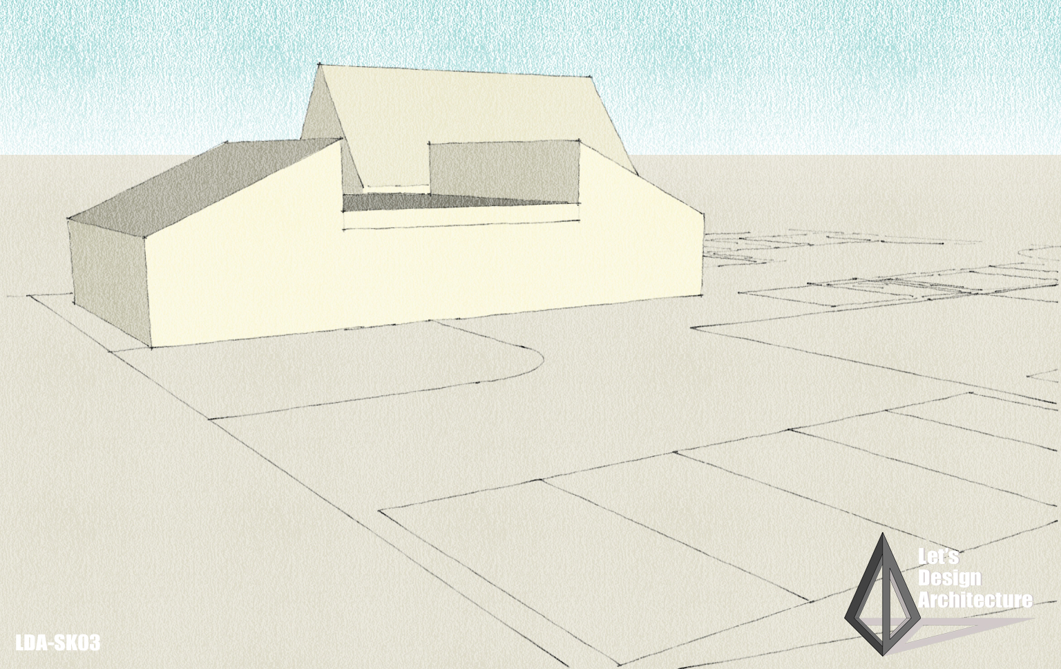
The side elevation shows how the roof works and how I have made a long building have less impact in terms of roof line and scale, which also allows high level windows to light up the internal spaces.

FRONTAGE
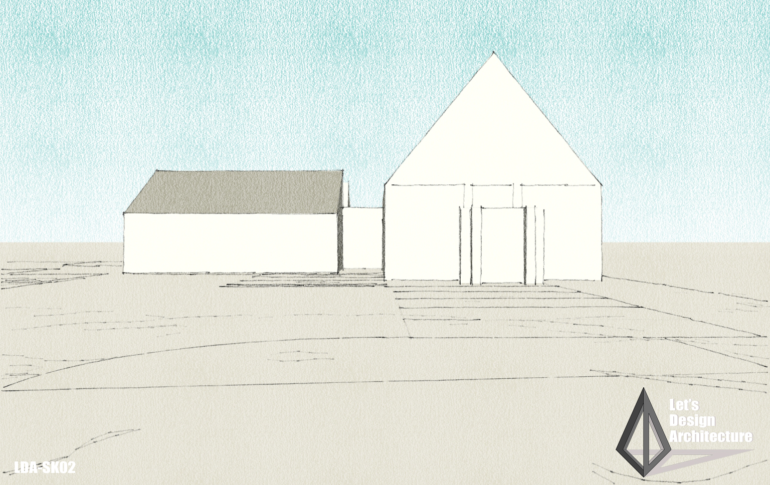
The view from the main highway shows that the chapel remains the main feature of the site with the proposed hall having less impact due to its low profile design.

SHORTLISTED
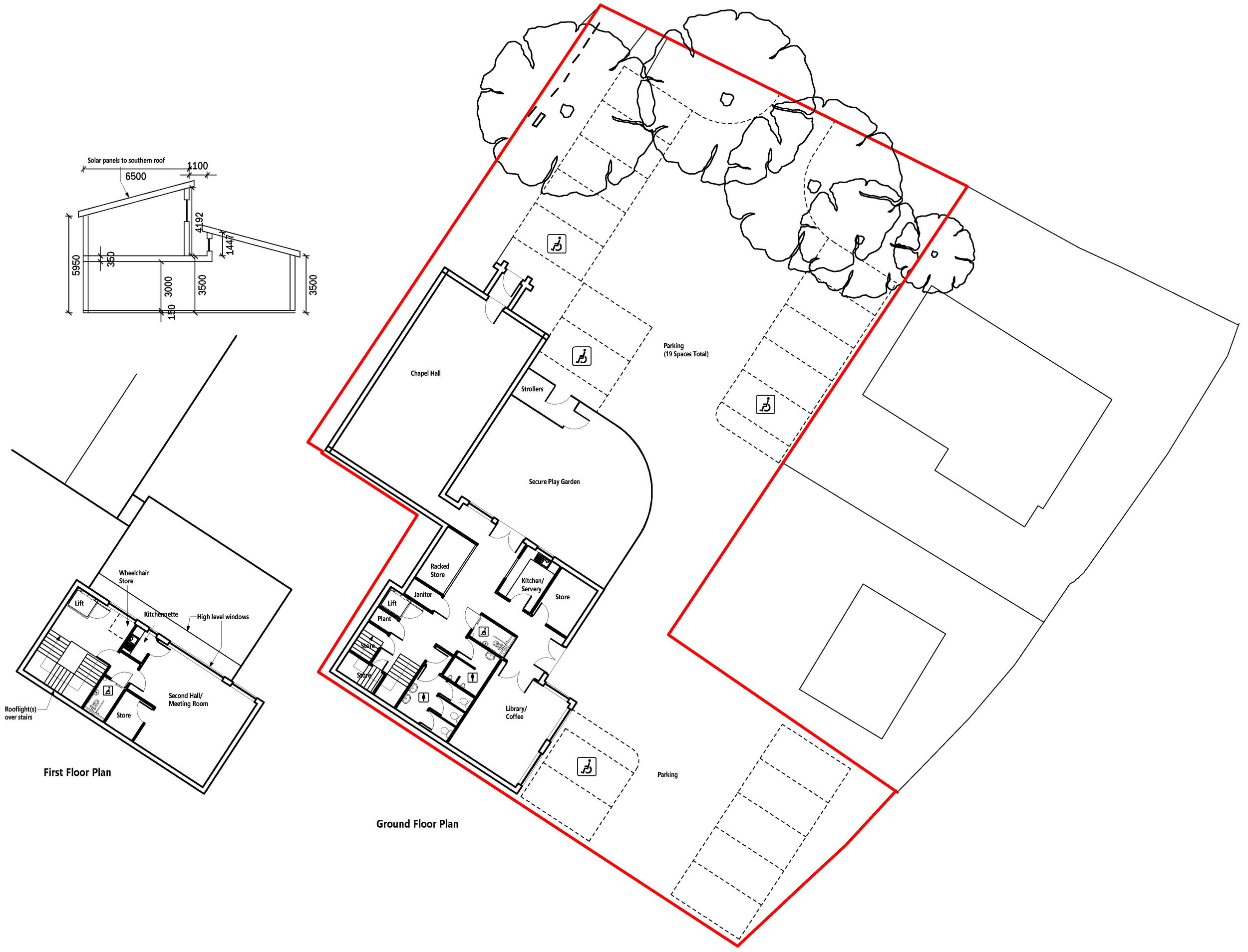
My scheme design was shortlisted down to three architects and I was asked to make a second presentation, with the proposed design being amended to suit the requirements of the community based on the ideas stemming from the first presentation. There was a specific requirement for the open space to be next to the chapel building, so I reduced the scale of the building to allow for this, incorporating a first floor over the rear part of the building.

SECOND CONCEPT SKETCHES
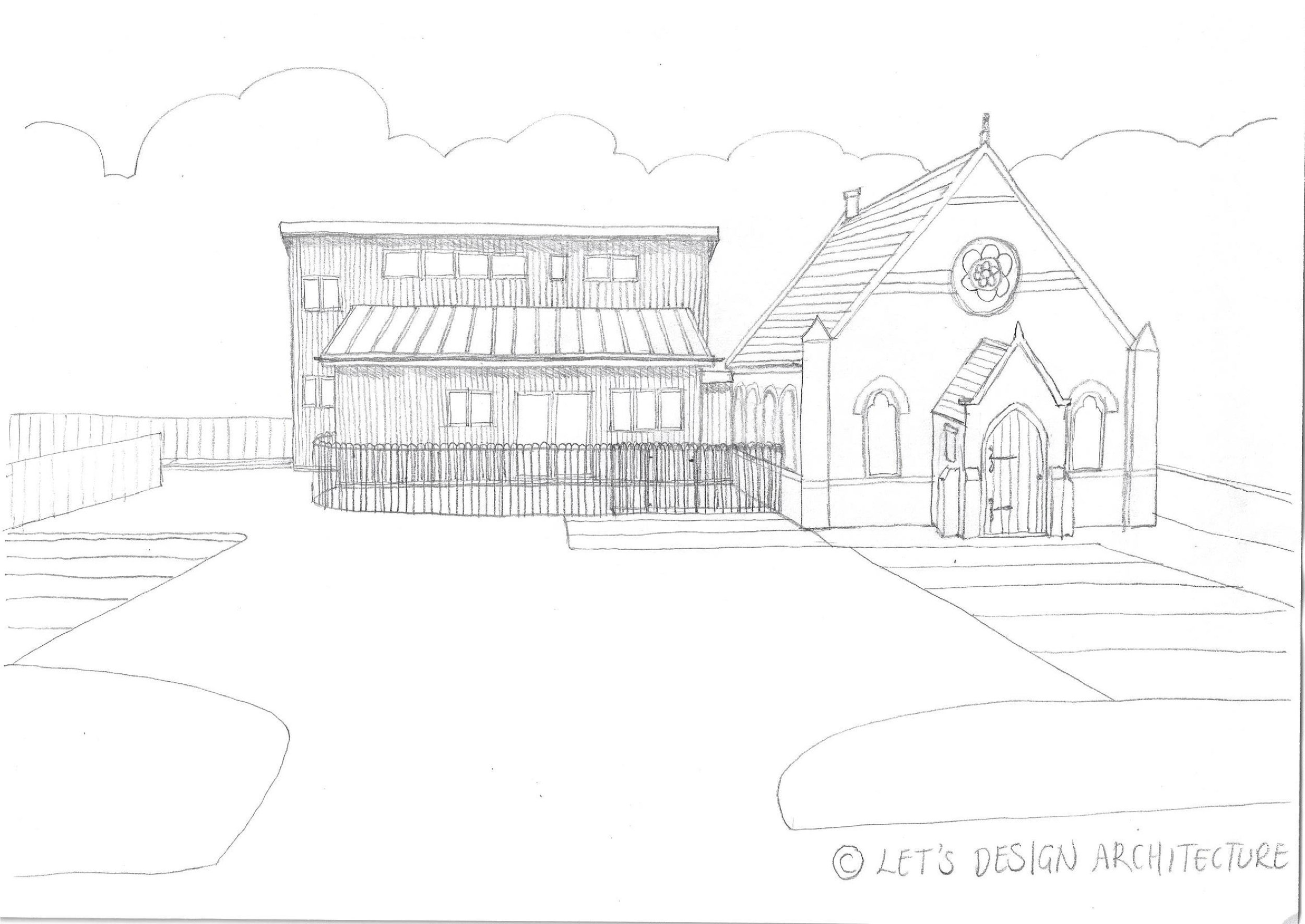
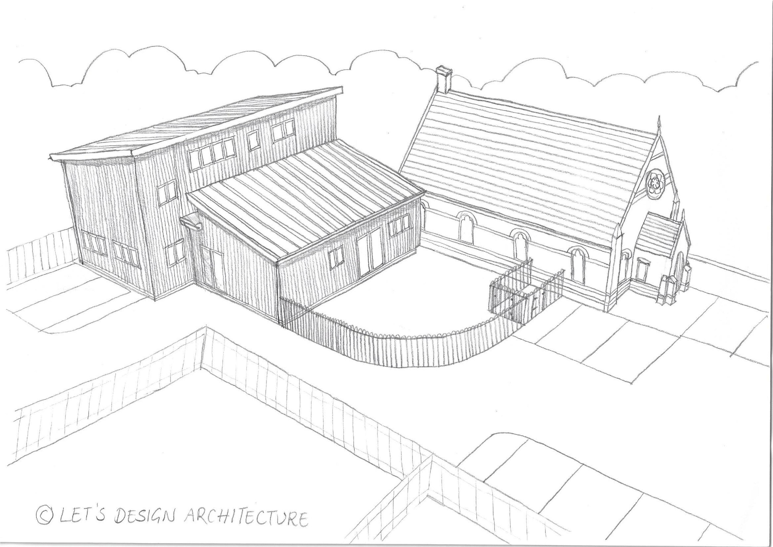
The second idea resulted in a modern building which would be timber clad with a zinc roof, with a garden area to the side of the chapel fenced in with iron hoop top railing, which would still leave the chapel open in appearance whilst including external space which would be useful for the user groups, especially the parent and toddler group who regularly meet on site. The first floor to the rear is situated far enough away from the chapel that it does not have a great impact on the visual appearance and blends the new with the old in a sensitive way.

RUNNER-UP
Although I was disappointed at coming a close second and not securing the job, I am proud of the work which I put in to the competition entry and how far I got being a sole trader, losing out only due to the scale of my firm and not the overall design. It has given me the confidence to enter into future competitions, knowing that I have the ability to produce design work which meets the user requirements of this scale of development and hopefully next time I will be successful.
“Having spent some time with you I feel certain that you will succeed in growing your practice and wish you the best of luck in doing so.”
- Parish Clerk
